
Collection Gems: June 2017
The United States Geological Survey (USGS) was established in 1879 when several Federal organizations merging into a single entity. In 1882 the Survey superimposed a grid of 15 minutes latitude by 15 minutes longitude on the country to map it at a unified scale. The resulting “quadrangles”, mapped between the 1890’s and 1950’s, are – with the exception of the State of Alaska – no longer produced, but were gradually replaced by a 7.5 minute quadrangle, the basis for modern US topographic maps. (I say “US topographic maps” because all other countries use metric scales of 1:25,000 and 1:50,000. A 15 minute quadrangle map scale is 1:62,500, while a 7.5 minute map scale is 1:24,000. A word about nomenclature: the larger the second number, the smaller the scale.)
The first topographic maps in the United States resulted from field surveys involving a survey tape and compass, and a barometer for elevation. Maps were made and updated using these tools until around 1940 after which aerial photographs have been used. Symbol colors also evolved over time. Brown ink was chosen to illustrate natural features like contours, lines connecting points of equal elevation. (The maps scanned for this article all use a 20-foot interval between contours). Black ink was used to illustrate human landscape features like roads and houses and blue ink used for water and wetlands. Green was used to denote vegetation beginning in the 1910’s. Red ink was introduced for major roads in the 1920’s and for marginalia pertaining to road distances to the nearest off-map population center.
The Hunterdon County Historical Society’s Map Collection holds 44 maps at three different scales, and of vintages from 1900 to 1973. While emphasis is, naturally, on Hunterdon County, much of New Jersey if represented by the smaller scale maps. Here are this month’s focus maps:
Figure 1 is Map 249, a 15 minute quad published in 1916
Figure 2 is Map 163, a 1 inch = 1 mile map published in 1948
Figure 3 is Map 277, a 7.5 minute quad published in 1955
(CLICK ON IMAGES FOR LARGER VIEW)
 Figure 1
|
 Figure 2
|
 Figure 3
|
It’s really interesting is to see what changes time has wrought on the locale – and the differences between what was represented on the maps. Figures 4, 5, and 6 are cropped images of the Milford area. Inspect the maps for some changes, which will lead to some intriguing questions. The contours north of town show more topographic variability in later maps.
 Figure 4
|
 Figure 5
|
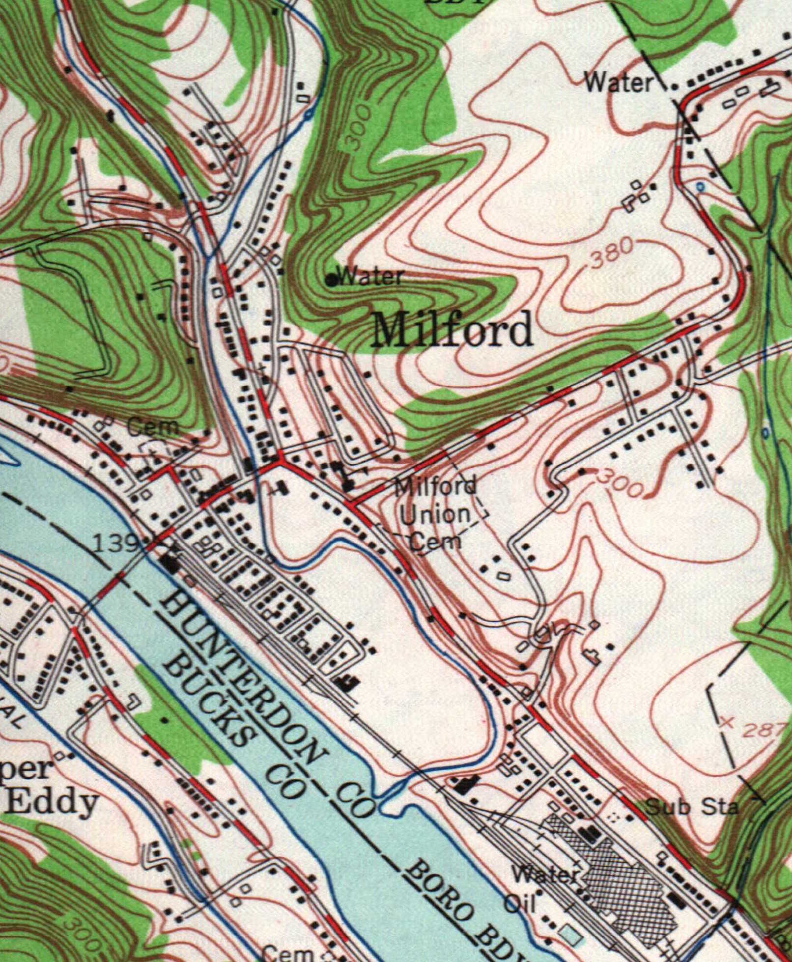 Figure 6
|
- Does this suggest significant erosion in that area or is it the result of mapping scale and methodology? (If erosion, was the delta – a prism of sediment – at the mouth of the small creek southeast of Milford and building into the Delaware River eroded from this area? See Figure 6).
What was once a road in 1916 connecting York/Javes Road with the Milford-Point Pleasant Road north of Milford is mapped as an unimproved road in 1948 and is no longer present by 1955.
- Is there anything still visible suggesting the road ever existed?
In contrast, look at the growth of Milford south of the creek (between the “B” and “E” in Belvedere on the 1916 map).
- Does this represent the expansion of housing for workers at the Curtis Specialty Paper Factory?
Notice, too, the growth of the road network on the south side of CR519 east of town.
On the 1948 map in Figure 2 there are numerous flagstone quarries mapped and a number of “gravel hills”.
- What were the flagstones used for? And what were “gravel hills?
Then notice the richness of detail in the larger scale 1955 map (Figure 3) which – in addition to including vegetation – also locates churches, cemeteries, schools, location of benchmarks (elevations surveyed), individual buildings, infrastructure (e.g.: sub stations, water towers).
All of these differences will dictate the scale best suited to your research. Perhaps you need to compare all three scales. So, when considering a map for research, consider the most useful scale: a large scale covers less area, but shows more features in that area. Smaller scale maps cover more area, but show fewer features.